Indigo Sails
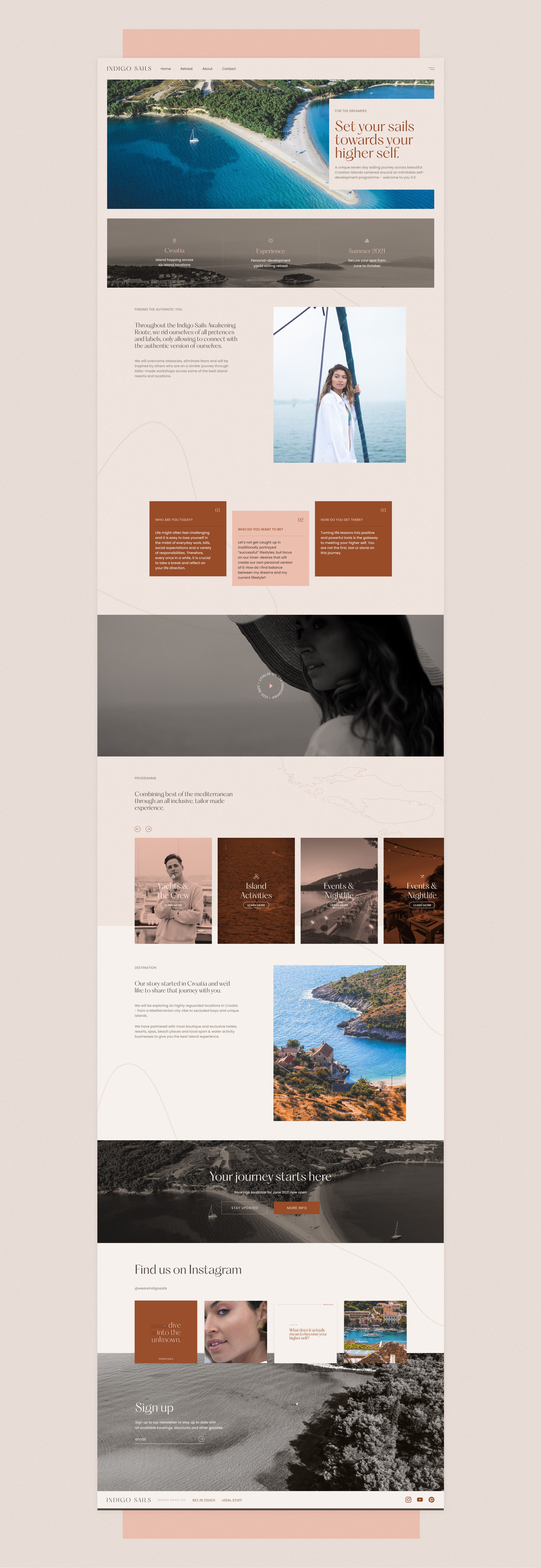
Indigo Sails creates self-development sailing retreats throughout the tropical coasts of Croatia. The brief was to create a brand identity that reflected a high-end experience with a bold and inspirational personality. The tone of the brand identity is nonchalant with a confident, encouraging dialogue. We wanted the brand's primary colour, rust, to be easily distinguished across social channels, profile pictures, favicon and other digital placements - this would help brand presence stand tall upon launch and early years of the business.
Catering to the target audiences, we created a minimal and spacial feel to convey the high-end product, the bold and elegant display typeface: 'PP Hatton', and the mood-driven imagery and design style to appeal to a millennial-Gen X audience.
Link to live site


The result was a beautiful brand that stood apart from the competition


